Despite the shift to digital, the best print adverts can still pack a lot of punch. They face same challenges as digital ads to get our attention with the limitation (and potential advantage) of being static content in a print format that makes it very easy to turn the page before taking more than a glance at the ad.
While print format is less hi-tech than newer advertising channels, the best print ads take just as much ingenuity to get right. An arresting image and clever copy are usually the keys to drawing us in long enough for us to receive the message the ad wants to communicate. And when they work, it can be highly memorable.
Below, we've gathered our favourite examples of print adverts from brands both big and small. Some are clever and creative, some made us laugh and others are hard-hitting or even controversial, but they also show how powerful the best print ads can still be to communicate a product.
For more inspiration, take a look at our pick of the best billboard advertising. And if you want to work on your own designs, see our pick of the best Adobe Illustrator tutorials.
Click on the icon in the top-right of each advert to see the full-size image.
The best print adverts we've seen yet
01. Land Rover

The best print ads often grab our attention by playing with our recognition of certain well-known products. That's best achieved through a simple, clear idea. This 2012 Land Rover print ad features two things we immediately recognise: a heavily stamped passport and the distinctive shape of a Land Rover. The ad was the work of RKCR/Y&R (now VMLY&R (opens in new tab)). The collage cleverly communicates the Land Rover's all-terrain characteristics, suggesting that it's ready for the challenge of any destination you might visit next. Now if only Land Rover's could fly.
02. Burger King
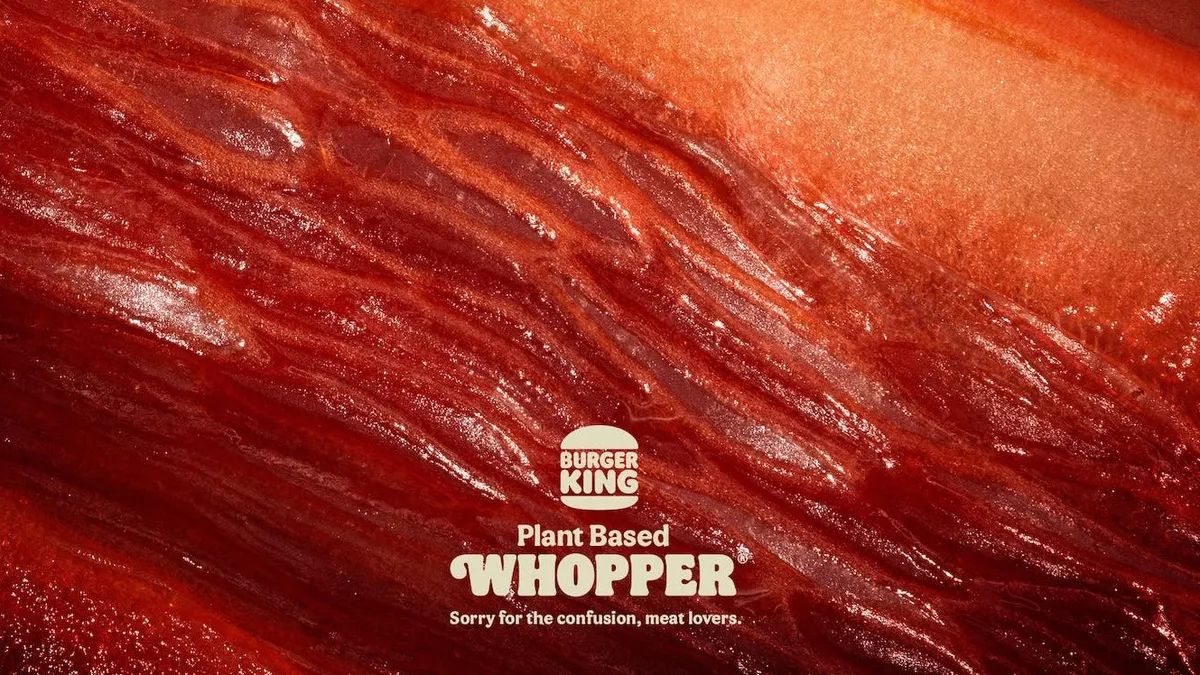
At first glance at Burger King's 2022 ad, you'd be forgiven for thinking you're staring at a macro close-up of some red meat. But no, those are peppers, beetroot and radicchio. This one is designed to make you double-take.
"Sorry for the confusion, meat lovers," reads the tagline – and indeed, you wouldn't know that's veg you're looking at. From the deep red colour to those thin fibres, the whole thing looks disconcertingly, well, meaty. This one was nominated for a CB at 10 Award as the best print ad of the decade.
03. Staedtler pencils
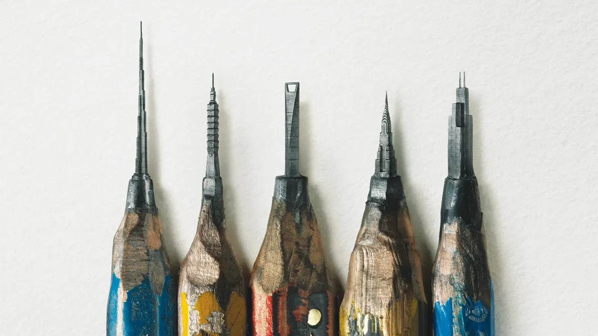
This campaign from a German pencil brand (by Leo Burnett Hong Kong (opens in new tab)) might just have left the sharpest impression yet. The poster for Staedtler pencils shows what looks, at first glance, like a bunch of bizarrely sharpened pencils. But look a little closer, and it becomes clear that you're looking at a series of impossibly intricate buildings carved into the lead. Find out more here.
04. Kit-Kat lockdown ad

Every now and again a concept ad comes along that's so brilliantly done, it fools people into thinking it's an official design. Sam Hennig (opens in new tab) recently created this Kit-Kat ad, which plays on lockdown life so cleverly it's gained massive amounts of attention across the internet.
Made for the One Minute Briefs Twitter account, the advert shows a daily schedule, totally consumed by Zoom meetings, with a Kit-Kat duo blocking out two slots in the middle, at 3pm. It's simple, relevant and completely on-brand. In fact, it's so clever, many are praising Kit-Kat itself for the genius, before realising it actually has nothing to do with the brand, officially (though KitKat and Zoom have responded to it via Twitter). Read more about it here.
05. Norwegian Airlines

This ad resurfaced recently on the internet, with folk going wild for the genius concept, so we thought it worth including in this roundup. Originally created in 2015 by Stockholm-based agency M&C Saatchi (opens in new tab), the ad, titled Flag of Flags, highlights five hidden flags inside Norway's (including France, the Netherlands and Finland). The destinations (and, of course, prices) are listed inside the rectangles in a pleasingly clean sans-serif typeface.
06. KFC (or is that Ikea?)

When KFC opened a new restaurant in an area of Majorca known locally as "where Ikea is"), the fast food chain decided to lean in to the association. Madrid agency PS21 (opens in new tab) mimicked Ikea's colour scheme and typography for the ad, leading to some good old brand banter between the unlikely rivals.
07. Sharper than you think

There's nothing worse than trying to cut, well, anything with a blunt knife. And so Hamburg-based design agency KNSK (opens in new tab) have nailed this print advert for the WMF Grand Gourmet knife. We're not sure why you'd ever need a knife that sharp, but this eye-catching ad leaves us in no doubt that this is one kitchen utensil you shouldn't mess about with.
08. Lime

In 1960, VW (opens in new tab) sold its trustworthy design to the world by labelling a car a lemon, the word commonly used to describe production defects. It had a minor default, not noticeable to the eye but even so it was taken off the market.
Well, fast forward almost 60 years and a Beetle is, once more, taken off the market. This time it's not for any default but simply because tastes have changed. And so it is a 'lime', and worthy of our print adverts roundup.
09. Happy Diwali

Ad agency Yellow (opens in new tab) uses a series of wide-eyed animals to highlight the very real problem animals face during Diwali celebrations. With super-bold imagery and bright colours, the campaign keeps the festival spirit. Juxtaposed against this, however, are the terrified eyes and shocking face masks of beloved pets and animals.
The images, strong enough to make this one of the best print adverts of all time, show how the animals could protect themselves against the different types of pollution were they able to, highlighting how it is down to the humans around them to protect them.
Or as the ad presents it: it's down to 'U': hence why the key letters are missing.
10. Children can be scary

The importance of safe sex can be a tricky topic to address, but DDB Mozambique (opens in new tab) took a humorous route with this print ad for Lirandzo condoms. The designs feature famously terrifying youngsters from well-known horror stories, including the creepy twins from The Shining, and The Ring's goosebump-inducing Samara. Would you want one of these guys living in your house?
11. IKEA iDealisk

The previous model may have been likened to a trash can, but the when Apple unveiled its new Mac Pro in June 2019, the design drew unkind comparisons of its own: there was something decidedly cheese grater-ish about it. IKEA Bulgaria jumped on the discussion immediately, and within a few days it had released this killer ad. Created by advertising studio The Smarts (opens in new tab), the design takes a bite out of Apple with its cheeky tagline and clever lower-case 'i' on the product name.
12. Hiper Centro Corona's optical illusion print advert

We love a good optical illusion here at Creative Bloq, and we've seen them come in all forms, from still images that appear to move to images that appear to change colour but don't. They're great for insights into how our brains work, but sometimes an optical illusion can make a great print ad too. The designer Felipe Salazar (opens in new tab) created this ad to advertise the kitchen offerings of Colombia's Hiper Centro Corona chain. At first glance it looks like a page of classified ads, but it's been designed in such a way as to form the shape of a kitchen, complete with extractor fan and kitchen tops.
13. Breakfast means breakfast

Popular yeasty spreadable, Marmite, has carved out an admirable little niche for itself as shorthand for anything that polarises opinion. And over the last couple of years there's been nothing quite so Marmitey in the UK as the result of a certain referendum, so this recent ad, created by Oliver (opens in new tab)'s in-house team at Unilever, feels kind of inevitable. Well played, Marmite. Too soon, but well played.
14. Copywriter needed

There's nothing particularly new about using pictograms to spell out a message in an advert, but we love the twist behind this one. It's a recruitment ad for a copywriter put out by RBH (opens in new tab), and the illustrated pictograms spell out 'Copywriter needed', with the ad going on to state that, 'The pictures people have taken over. We need a words person.'
15. You eat what they eat

The amount of plastic being dumped in the ocean is so far beyond what we can comprehend that it doesn't bear thinking about. But that doesn't mean we shouldn't, as the team at German advertising company Ogilvy (opens in new tab) highlight with this campaign for Sea Shepherd Conservation Society (SSCS) (opens in new tab), an international non-profit, marine wildlife conservation organisation. The print ad campaign depicts a number of different fish, misshapen by various plastic objects, with the tagline 'You eat what they eat'. The ad goes on to encourage viewers to help clean up our oceans by donating to Sea Shepherd.
16. Open all night

Another great offering from McDonald's, this time from the team at Leo Burnett (opens in new tab), who followed the modern and minimal aesthetics of McDonald's communication with this striking visual. In a clever use of illustration, the iconic 'M' becomes lights in the night, sending viewers the message that no matter what time they want to visit, even in the middle of the night, McDonald's is open for business.
17. Where there is one, there are more

Boeker Public Health is a major pest management and food safety company based in the Middle East. JWT Dubai (opens in new tab) created these beautiful-but-gross print ads based on the idea that when it comes to pests, if there’s one, there will be more. The agency focused on replicated an authentic Russian Matryoshka doll aesthetic, first painting each design onto a wooden surface, then mapping these designs onto a 3D rendering of a doll. The project picked up multiple awards.
18. Piknic Électronik

This long-running print ad campaign can be found on the streets and subway stations of Montreal, promoting an all-day electronic music festival that is held every Sunday in a park throughout the summer. The adverts feature bright, poppy photography combining fruits with musical equipment; a simple concept that effectively captures the idea of ‘fresh sounds’. Ethos (opens in new tab), the studio behind the campaign, created the images by photographing real objects that had been hand-painted in different colours.
19. A Better Job is Waiting

Created by Joe Public United (opens in new tab), this print campaign for a job portal (opens in new tab) aims to motivate people to stop slogging it out in a job they don’t like. Deftly retouched photos show bored workers at their desks, sat still for so long mould has started to grow on their bodies, or spiders have set up their webs on them.
20. Lickin' chicken

If there's one thing we all know about KFC, it's that it's finger-lickin' good, and it's this irrefutable fact that's inspired this series of frankly unsettling print ads. In them, everyday objects suddenly sprout mouths wherever your fingers might touch them, in the hope of licking off a little of the Colonel's chickeny goodness. It's the work of Zane Zhou (opens in new tab), along with LamanoStudio (opens in new tab) in Chile. Thanks for tonight's nightmares, guys.
21. Kiss with Pride

It's been over 50 years since homosexuality was decriminalised in England and Wales, but today it's still illegal in 72 countries around the world – and punishable by death in eight. To highlight this, Absolut, in collaboration with LGBTQ charity Stonewall (opens in new tab) and BBH London (opens in new tab), created this series featuring close-up shots of same-sex kisses, with many of the subjects coming from the countries where these kisses could land them in prison, or worse.
22. Pass the Heinz

If these clever adverts for Heinz look kind of familiar, it's with good reason. They originally featured in an episode of Mad Men where Don Draper tried to pitch a series of ads showing food that goes great with ketchup, but without the ketchup itself visible. Draper argued that people would fill in the gaps for themselves and create a stronger association in their mind, but Heinz wasn't going for it. In real life, however, the company's on board with the idea, with DAVID Miami (opens in new tab), rolling out these near-exact reproductions of Draper's pitch.
23. Flame grilled

Burger King prides itself on flame-grilling its burgers rather than frying them, but we all know how fire can misbehave if you don't keep a close eye on it, right? Burger King holds the record for the most restaurants that have burned down since 1954, and that's the brilliant angle seized by DAVID Miami (opens in new tab) in one of its many innovative campaigns for the company, using genuine photos of blazing BKs to emphasise how it cooks its burgers.
24. FCK

In spring 2018, the unthinkable happened. KFC ran out of chicken. Thanks to problems with a new distributors, the Colonel ended up temporarily closing most of its 900 UK restaurants. KFC handled it like a true pro, putting its hands up and accepting responsibility, and bringing in Mother London (opens in new tab) to create a print ad apology that instantly went viral. It even picked up a Wood D&AD Pencil in writing for advertising. Check out more companies that have mastered the art of saying sorry (or not) in our roundup of the good, the bad, and the WTF of brand apologies.
25. Pee on this ad

Usually, if someone wants to wee on your advert, it's not a good sign. However, Ikea actively encouraged it in this crib advert, which doubles up as a pregnancy test. If the result was positive, the retailer would offer the mum-to-be a half-price crib, shaving pounds off the several thousand they'll be shelling out for their upcoming bundle of joy. To create this ad, agency Åkestam Holst (opens in new tab) worked in partnership with material technology company Mercene Labs (opens in new tab).
26. Delta Dating Wall

According to Delta, world travellers are more likely to attract right swipes on Tinder, but what if you can't afford to go away to snap that perfect profile pic? That's what Delta – along with Wieden+Kennedy (opens in new tab) New York and Colossal Media (opens in new tab) – addresses with the Delta Dating Wall, an epic print advert in Williamsburg, Brooklyn, featuring exotic backdrops that you can stand against for a selfie, instantly making you a lot more windswept and interesting.
27. Random cabbage

Wieden+Kennedy London was tasked with raising the profile of Chambord among a target audience of women aged 24-35. It used the campaign to push back against the pressure on women to conform to certain rules with its 'Because No Reason' tagline that encourages people to do what they like, just because they like it.
28. Ridiculous possibilities

You never know what you'll find when you go shopping in TK Maxx, and the spontaneous, surprising nature of the shopping experience in this designer discount shop is brought to the fore by this campaign emphasising the 'ridiculous possibilities' that lie inside. It's the work of Wieden+Kennedy, with other examples highlighted including smartly dressed women scaling the side of a building on a rope made of silk scarves, and a biker doing ballet.
29. See what you want to see

This print ad campaign was created by Leo Burnett France (opens in new tab), and plays on the idea that with Jeep, you can go wherever you like and 'see what you want to see'. Each ad features an image of an animal, which, when turned upside down, turns into another creature from the other side of the world: the giraffe becomes a penguin, the elephant a swan and the doe a sea-lion.
30. Save paper

It's a bold move for a company that has built itself on selling paper books. When Penguin needed to push its audiobook offering, Miami Ad School (opens in new tab) decided to tackle the eco issues of paper production head-on. The intricate illustration in the bark is a lovely touch.
31. Take a breath

Ogilvy once again proves itself as a print advertisement master, this time in a campaign for allergy medicine. Simple yet effective colours and a smart illustration trick – using the silhouette of common allergens to 'block' the figure's nose – make this an ad that pops from the page.
32. Sticky ad

Ogilvy is known for creating some of the best print advertisements around the world. This is just another example of its brilliant work. Created for Fevikwik Instant Adhesive, it's one of a three-part print advertisement series that uses clever illustration and a monochrome colour scheme to its fullest potential.
33. We are made of rock

Created by DLV BBDO (opens in new tab) in Milan, Italy, the simple execution of this print advertisement works wonders for music magazine Rolling Stone. A cool image paired with a brilliant tag line ('We are made of rock') capture the brand's attitudes, product and ethos effortlessly. Using a signature-like handwriting font also ties in with the rock star aesthetic.
34. Yoga for your back

Created by Israel-based advertising agency McCann (opens in new tab), this print ad for Ashtanga Yoga homes is on the benefits of yoga. In it, the bones of the spine are transformed into a snake; a concept that also deftly captures the idea that yoga will bring you a super-flexible back. The tagline 'Before your back attacks you, Ashtanga Yoga at the Garage fitness club', drives the point home.
Next page: More awesome print ads